Chivas Regal
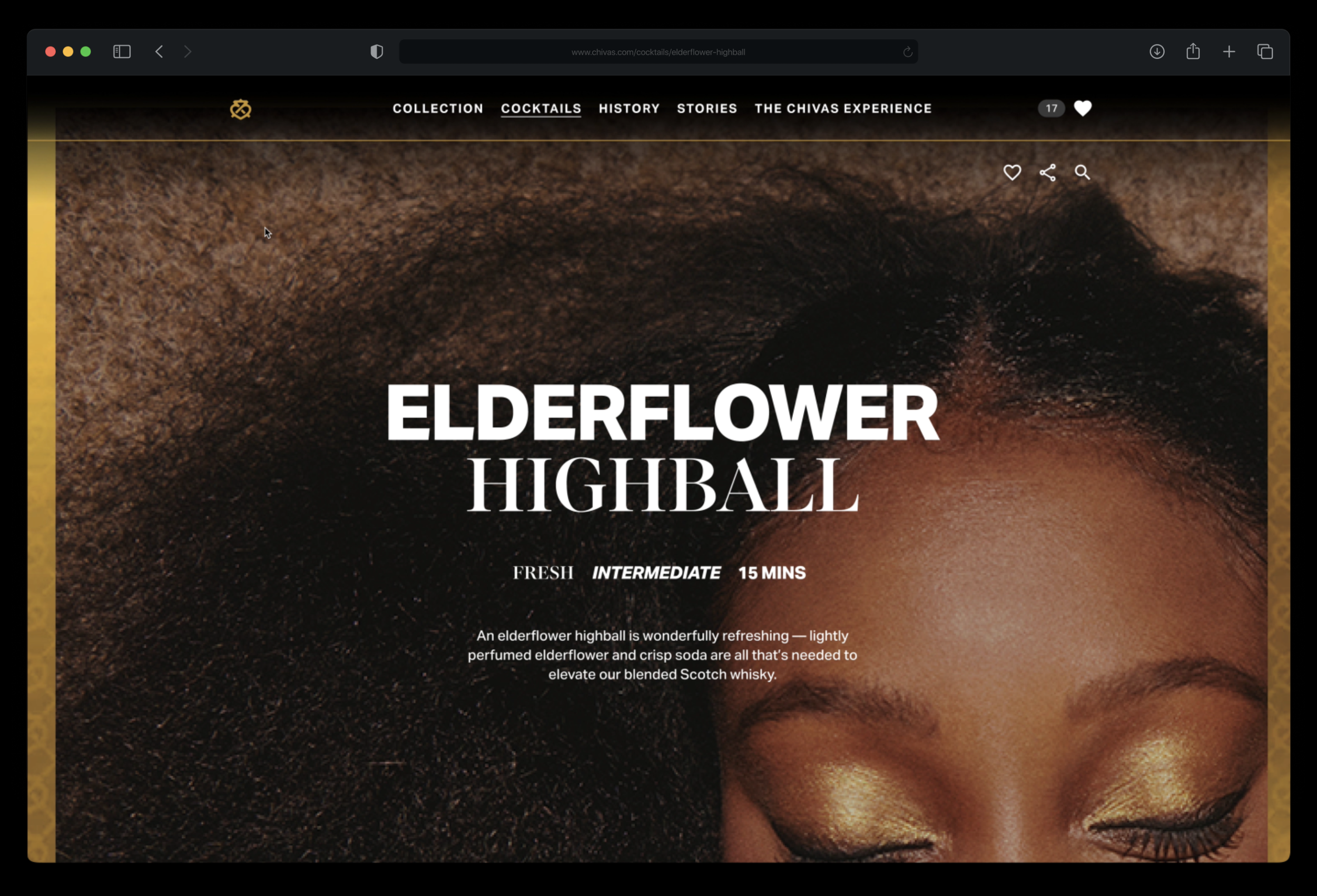
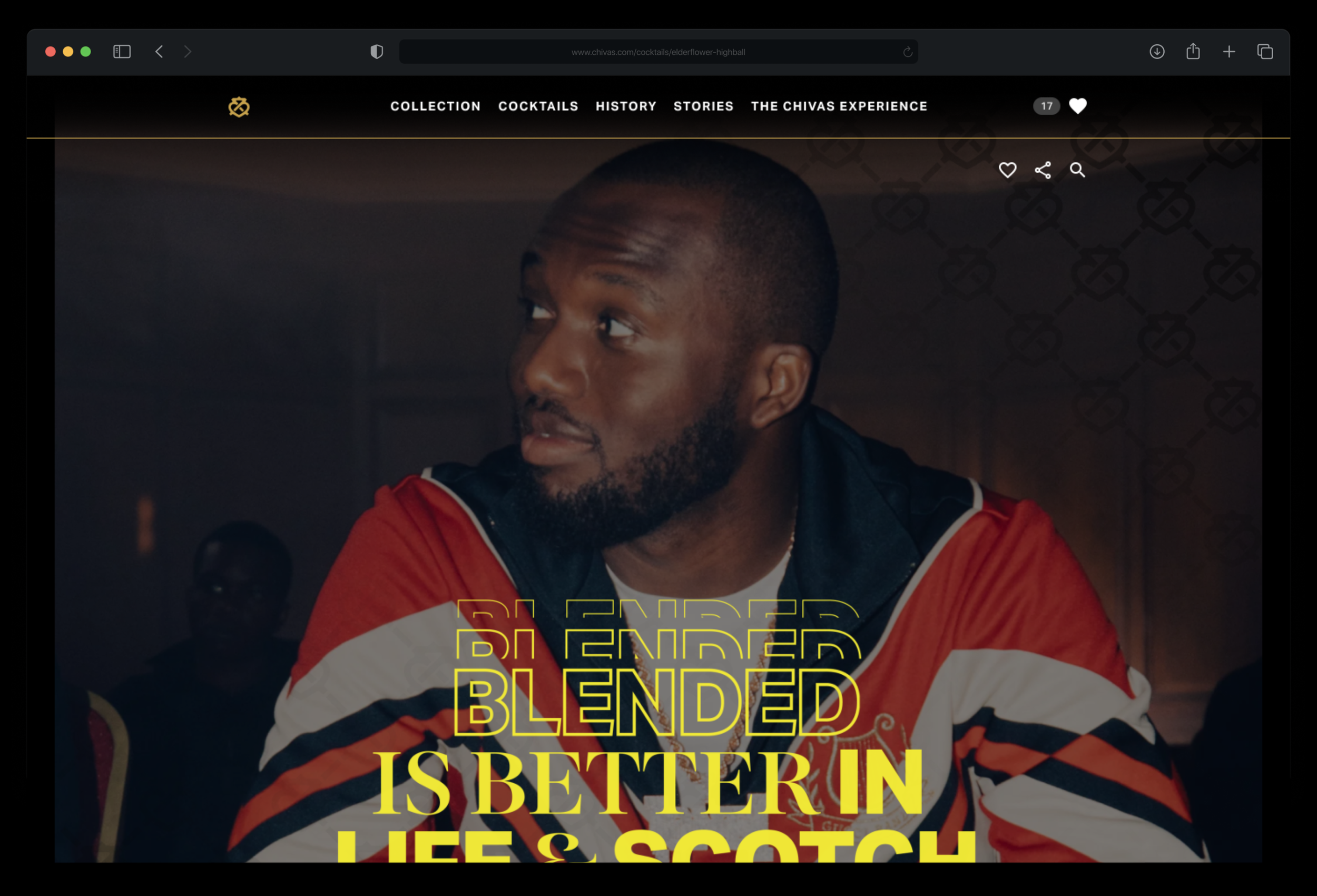
Chivas has recently undergone a rebrand and is repositioning itself as drink of choice for Generation Z. In order to resonate with this audience, it has a bold new look and feel which relies on the theme of clashing forces — a theme which rings true in the use of typography, colour and textures. The brand has a complex style guide, incorporating colours and fonts you wouldn’t normally pair together. We added in oversize imagery and unusual crops to create something truly bespoke.
It was a huge amount of fun to work with, and below you can see a selection of some of the rich, playful layouts we designed for their new site whilst working at Karmarama. I animated some of the more complicated pages to give an indication of how the elements interact with each other as the user explores the site.